A multi-platform experience helping consumers close the gap between healthy intention and action.
Company
Turner Broadcasting / upwave
Designed
2013–2014
Role
Design director

―
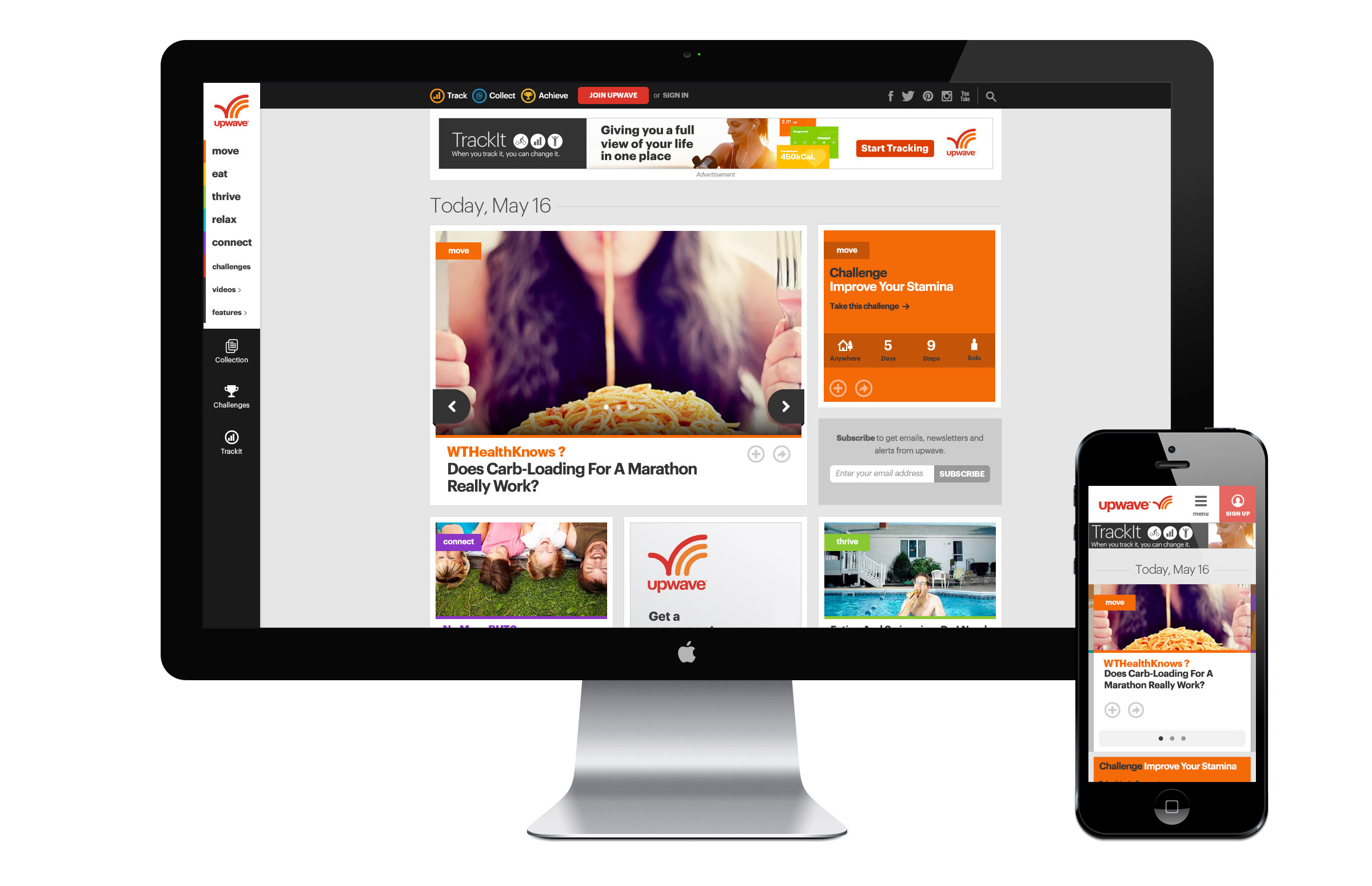
upwave was a health and lifestyle media brand launched by Turner Broadcasting. I led the design of upwave’s digital experiences from its launch in August of 2013 to the brand’s close in May of 2014. During that time, the multi-platform, digital-first start-up grew from nothing to 1 million average monthly uniques, 27.2 thousand registered users, and 9.5 million total visits in only 8 months.
Color
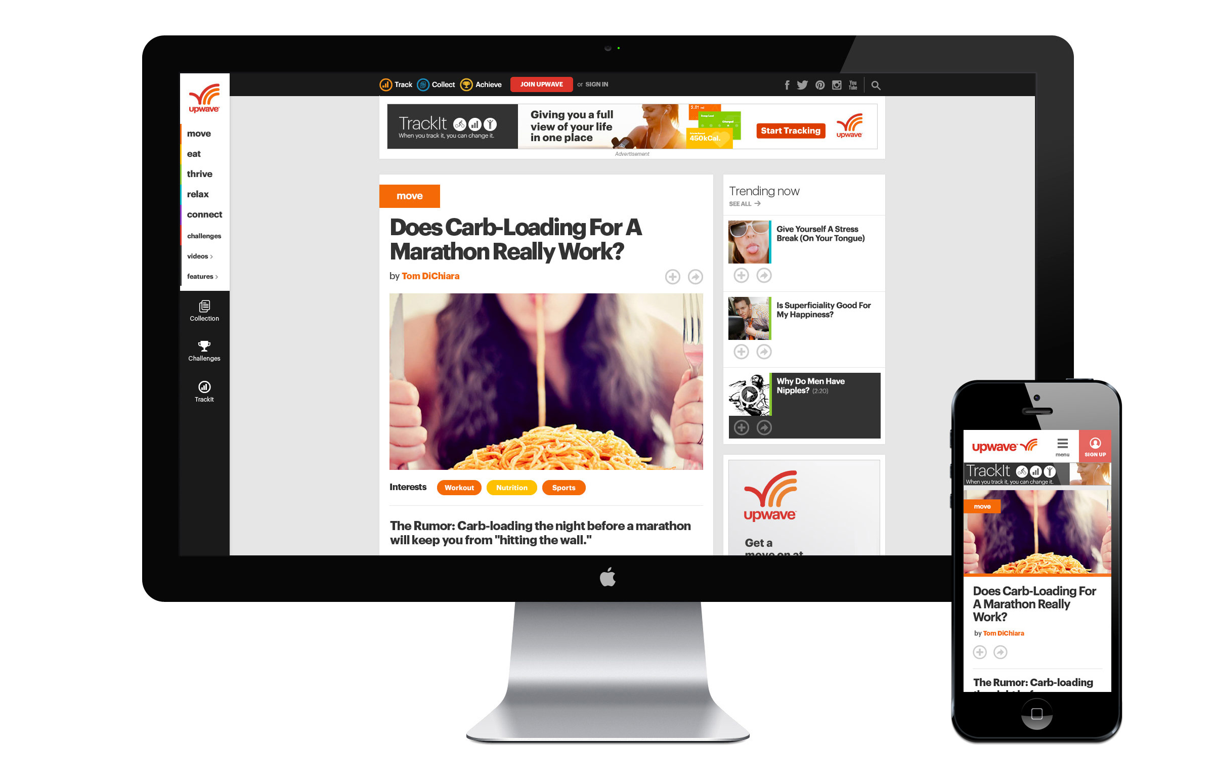
Each of upwave’s five content verticals were assigned a unique color. Along with the standard upwave red, this comprised the primary color palette. The secondary palette was made up of a limited color range anchored by each of the 5 vertical colors. The use of pure black was avoided in lieu of a softer dark charcoal, giving the experience a less severe, more approachable feel.
Typography
The primary typeface used across upwave was Graphik, a clear and stable neo-grotesque-style face that was tracked tightly at larger sizes. While Graphik made for impactful headlines, it had poor readability at smaller sizes. As a result, we introduced Open Sans for body copy. Designed with on-screen readability in mind, its more varied letterforms made for easier, effortless reading.
UI elements
Interactive elements across the site were designed for touch, even those used primarily on larger browser sizes. This made for larger, clearer actions on all platforms.
Grid
upwave was designed responsively using a 12-column grid, which was broken up into three primary content columns. Cards were used as the building blocks of the structural system.
Cards
Cards were designed at three relative sizes that fit cleanly into the grid, providing page layouts with consistency and flexibility. The smaller card sizes were designed to be used on both desktop and mobile and the structural system itself was designed to withstand incremental expansion (i.e., additional card sizes).

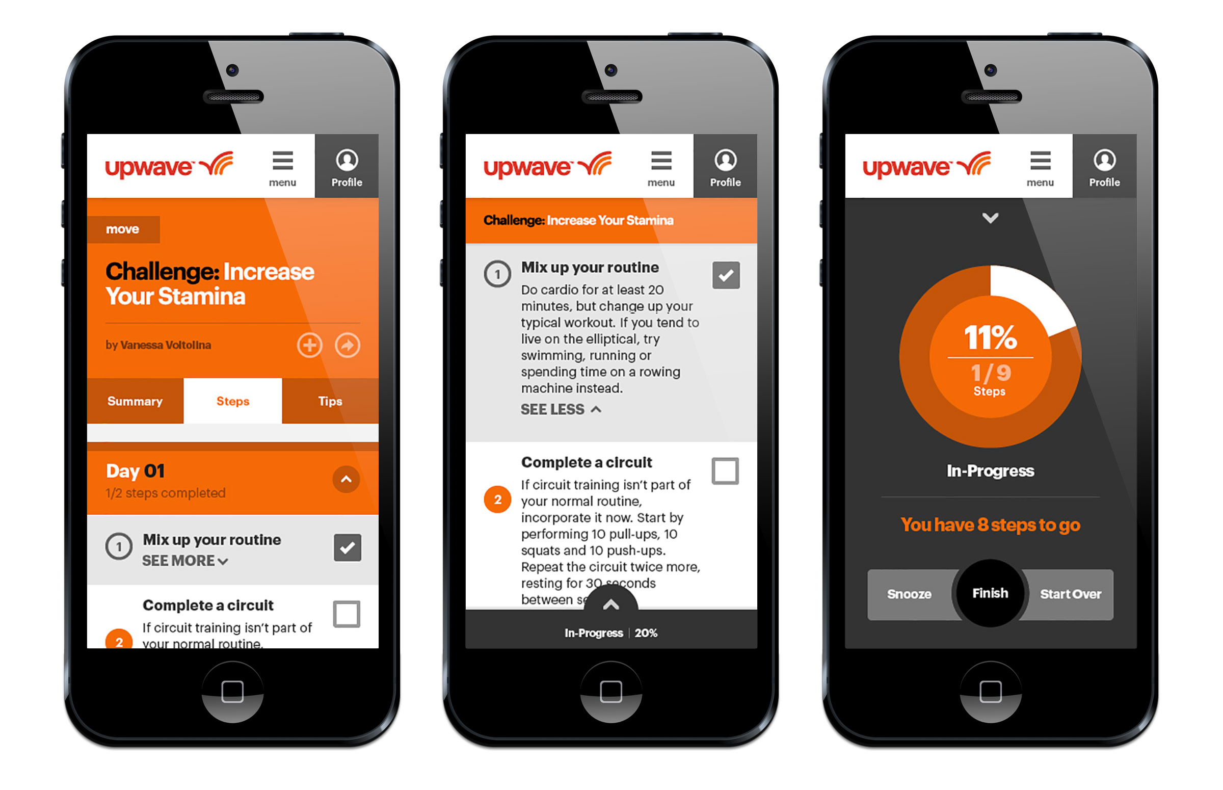
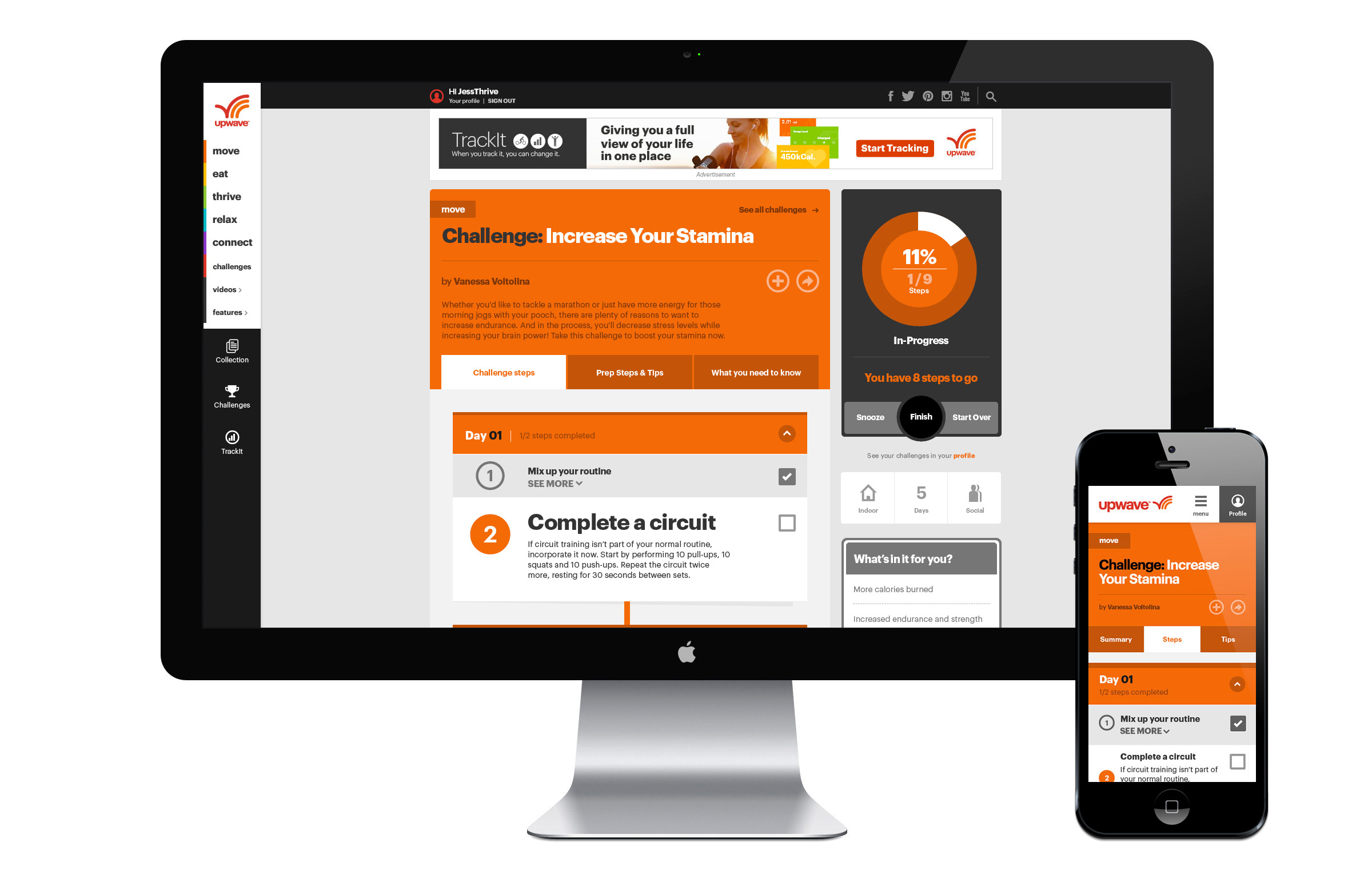
Challenges
Challenges offered users a clear, structured program to achieve a particular goal over a given period of time. Once users initiated a Challenge, they could check off a series of steps linked to bite-sized achievements that moved them closer to their goal. An interactive dial gave them feedback and encouragement along the way.
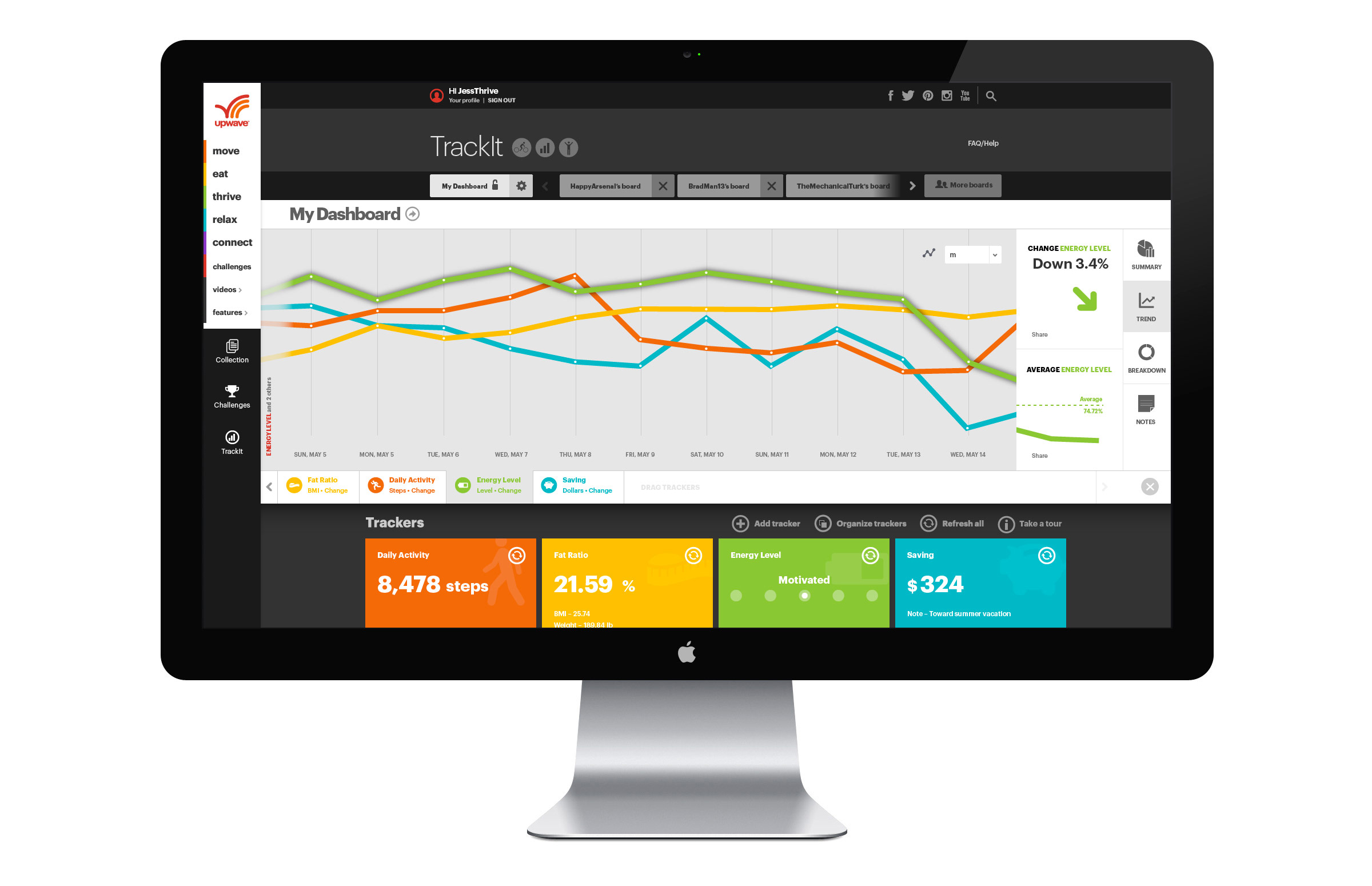
TrackIt
TrackIt was a web app that pulled together users’ lifestyle apps and devices and collected their data in one easy-to-find spot. Tracker Cards displayed individual data feeds (steps, local weather, coffee consumption, etc.) that could be pulled onto a staging area and plotted against each other to tell a unique story about a user’s activity.