As Design Director for Motorola's Consumer Experience Design team, I lead visual strategy and design systems for mobile device software on Motorola’s 100 million active devices globally.
2022 Design Language
Dynamic & adaptive
Motorola’s Design Language for 2022 (codename: Adapt Design) debuted as a new visual design language that brought the Motorola Brand together with Android and Material Design 3.
Motorola + Android
Adapt Design works with Google’s “Material You” color system to bring the rich, premium feel of the Motorola brand to Android 12 and beyond.

Color
The Adapt Design color system optimized our brand colors for digital interfaces by translating them into a set of color ranges with standardized saturation and brightness to ensure consistent contrast when used as dynamic colors.

Dynamic color system
Android 12’s Material You color system relies on Google's Monet algorithm to create five unique tonal ranges based on a single input color.
Because our design work needed to begin before Google had completed documentation, I worked with our development team to reverse-engineer it through extensive analysis and testing, allowing our teams to hit our launch target.
Icons
Colorful, cohesive, on-brand.
Our icons make finding an app easy and can evoke the Motorola brand when it’s most important.
Typography
Previous versions of Android used Roboto as the default font. With Android 12, the Pixel moved to its proprietary Google Sans font as the default. In keeping with the goal of bridging the gap between the Motorola brand and Pure Android, I designed a custom typeface just for Motorola UI, called Rookery, that straddles the line between Google Sans and Motorola’s licensed brand font Gotham.
Creating Rookery
Rookery is a modification of open source typeface Montserrat, a modern geometric sans serif that shares many common features of Gotham. However, Montserrat has a few distinctive quirks that are not optimal for UI application and don’t align as well with the Motorola brand aesthetic. The G, J, Q, 3, 4, and 7 were modified, kerning pairs were adjusted, and the entire character set was condensed slightly to account for density of information and to ensure that localized strings didn’t break unexpectedly.

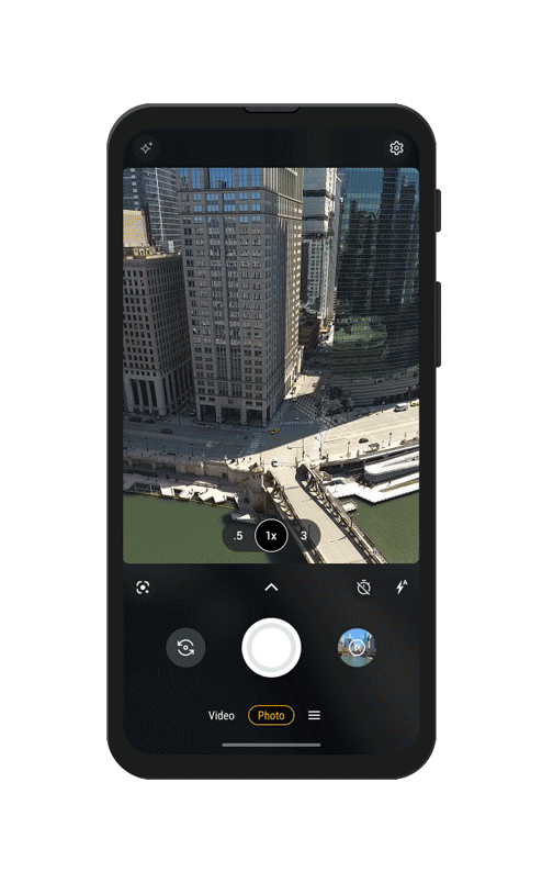
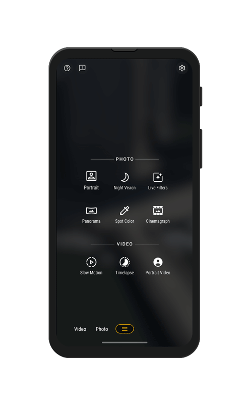
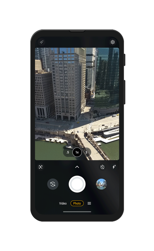
Moto Camera
Since 2017, I have led two redesigns of Motorola’s Camera app. The first launched in 2018 to accommodate dual cameras and an expanded feature set. The most recent update launched on the Motorola Razr 5G in September 2020 and was built to work across a wider range of display sizes and form factors.

MotoCam1
The previous app interface was designed to be clean and simple with the viewfinder as unobstructed as possible. However, with the advent of dual camera phones, users expected to see advanced features front and center.

MotoCam2
In late 2017 we began redesigning the Moto Camera App with the goal of surfacing new features and making navigation more intuitive. We also needed the app to accommodate taller 2:1 displays in addition to the standard 16:9.

MotoCam3
In early 2020 we began a ground-up redesign of the camera app to make the experience more expansive, more immersive, and more accessible. We wanted to make it easy to take photos and videos with one hand and with some devices being as tall as 22:9, that meant moving much of the UI to the lower half of the display.
Design principles
Intuitive
Accessible and easy to use
Intelligent
Frictionless and predictive
Empowering
Powerful and encouraging
Flexible
Responsive and adaptive
Immersive
Streamlined controls let you focus on capturing the moment. Everything else is easily accessible when you need it.
Customizable
Save your favorite modes by dragging and dropping them from the menu directly into your carousel for easy access.
Accessible
Switch lenses and fine-tune zoom, all with one hand.
Shutter animations

2018 Design Language
Color
The 2018 Moto UI color palette was developed to act as a bridge between Motorola’s device CMF design and Google software experiences. I mixed various Material Design hues to create a color system that felt at home in Android OS while asserting itself as uniquely Motorola.
App icons
Inspired by layered paper, the Motorola app icon set was built to be colorful and cohesive. Refined gradients and subtle layering provide depth and dimension to help set Motorola apps apart without making them feel out of place next to other Android apps on the homescreen.
Moto Time Typeface
From the Motorola “batwing” logo to the camera housing on the back of our phones, circles were prevalent in our design language in 2018. To lend some brand personality to our device homescreen, we designed our own typeface for our homescreen widget, starting with the circle as a core structural element. My primary role was building the typeface based on an initial design concept.
I introduced subtle vertical and horizontal stress to the circles to give them balance and weight while still maintaining the typeface’s geometric integrity, and I varied the line width and softened the transitions at the joints for optical consistency. Then I expanded the character set, created an additional weight for use at smaller sizes, and built the font software so that it could be used seamlessly alongside Roboto as our broader system font.
All images Copyright © 2016–2023 Motorola Mobility LLC. All rights reserved.