I have 18 years of product design background
Here’s some of the work I’ve done over the years
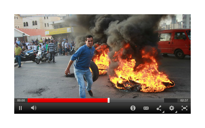
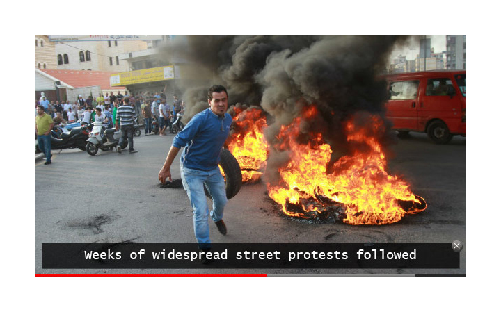
An immersive HD video experience heralds CNN’s entry into the world of streaming television
CNN (2010–2013) / Lead UI designer
Role
Partnered with UX designer within an agile team structure. Responsible for responsive UI and final execution.
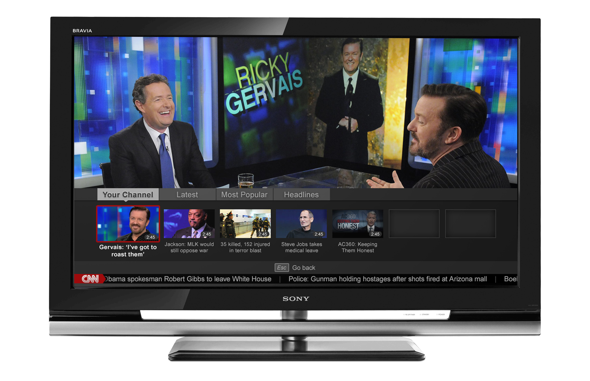
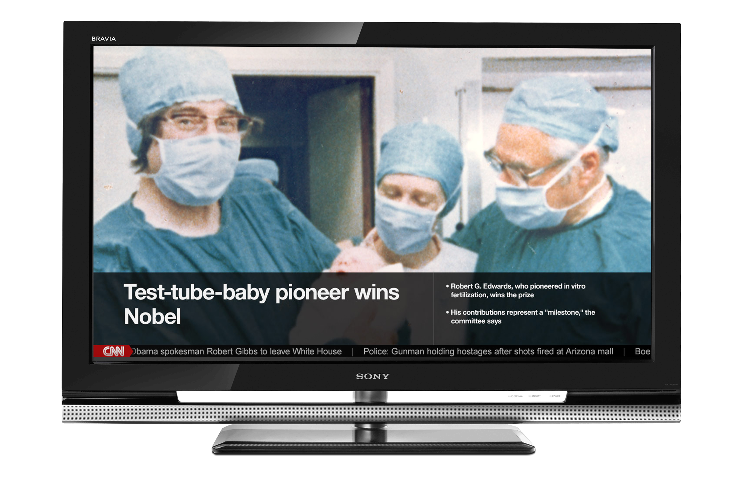
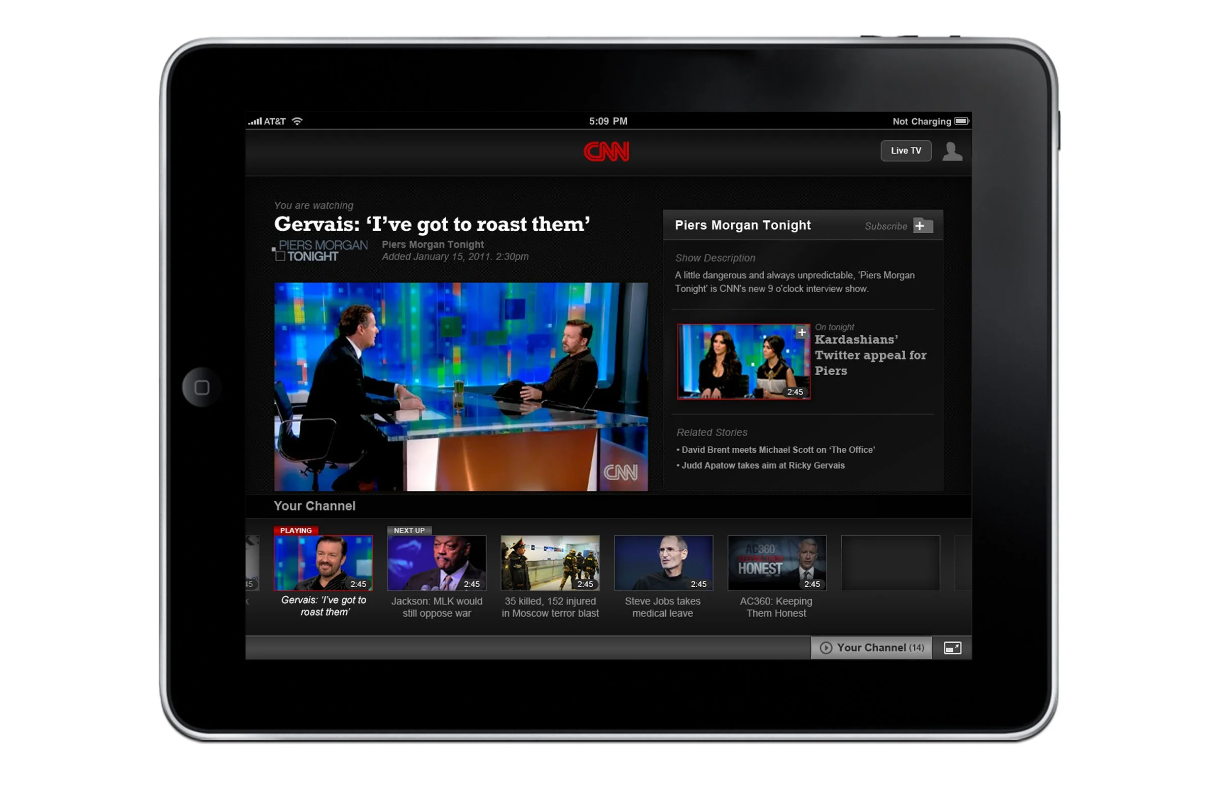
From 2010 to 2013, I led the UI and interaction design of the new premium digital video destination at CNN.com. An immersive experience focusing on the delivery of large high-definition video, it also allowed for the simultaneous discovery of editorially curated video content and marked Turner's first move toward letting cable and satellite subscribers stream a live TV broadcast across devices.

“Lean back” experience
As part of TimeWarner's broader ‘TV Everywhere’ initiative, we brought CNN and HLN's authenticated live TV streams to web, iOS, and Google TV.
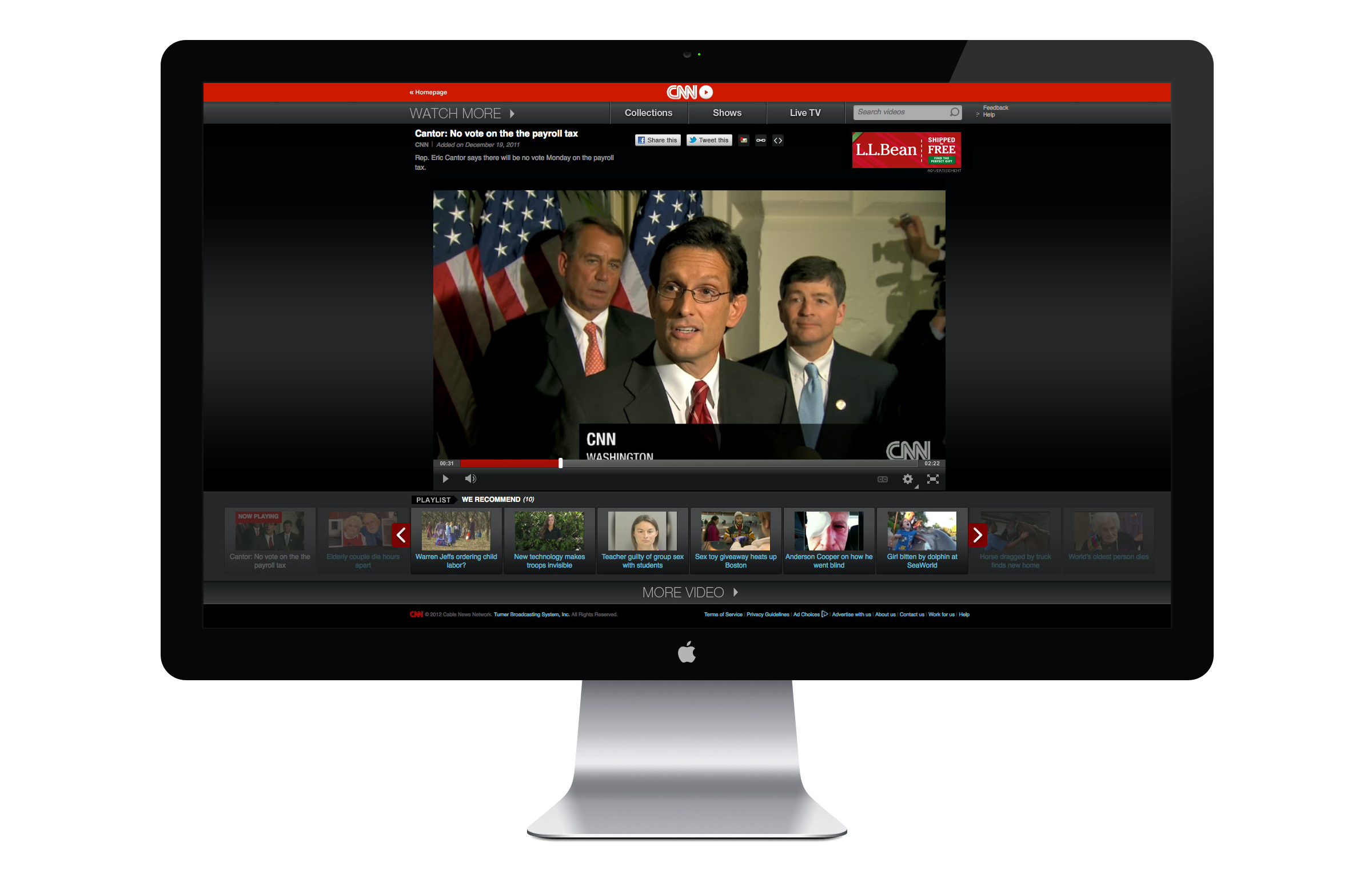
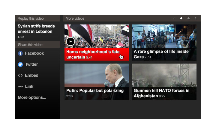
The key challenge in designing the desktop experience on CNN.com was finding a way to give users the ability to watch and browse videos simultaneously. After designing a number of concepts and implementations, we eventually settled on a solution that involved two modes: a cinematic view and a browse view.
In cinema mode, the focus was the large, high quality video player and the currently active playlist. In browse mode, the user could select videos from a number of editorially curated playlists while the active video played in a smaller, docked player. Tabs at the top allowed users to view different categories of content.
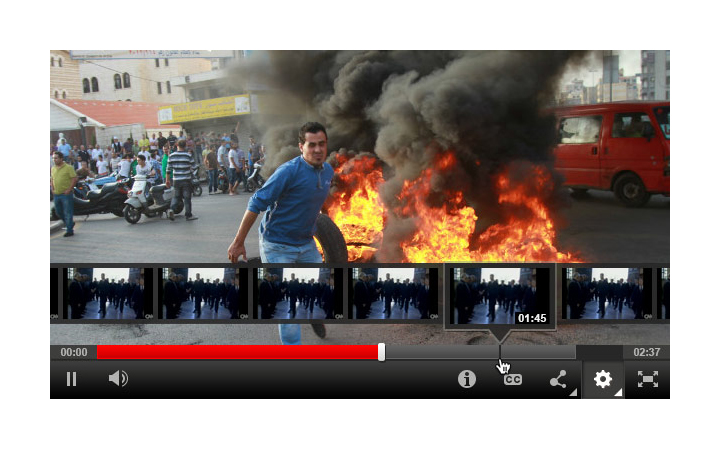
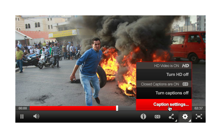
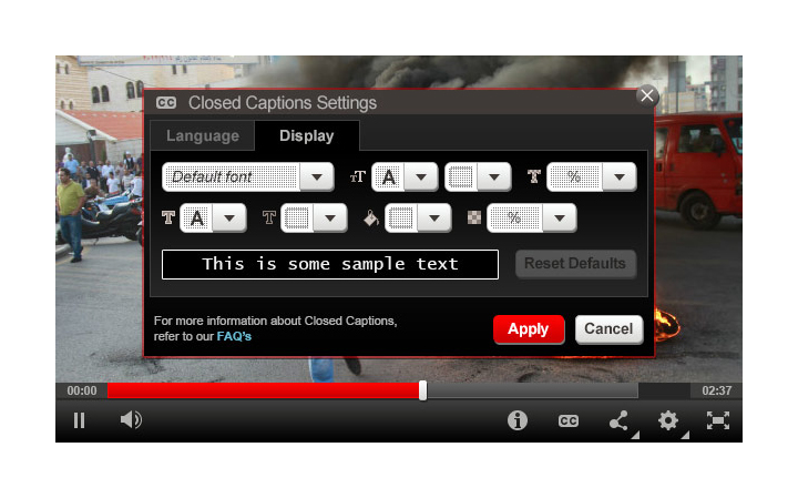
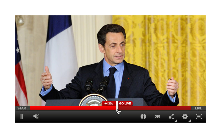
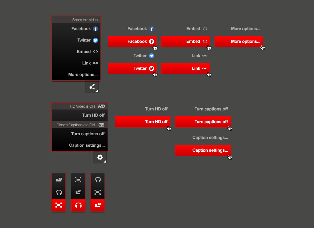
Core video player
In tandem with the redesign of CNN.com's video page, we redesigned the player to be fluid based on the user's browser window size. We created a simpler, bolder set of controls and integrated closed-captioning and video quality settings. We then expanded this player to work in live experiences featured on the CNN.com homepage and in embeddable players.


A multi-platform experience helping consumers close the gap between healthy intention and action.


upwave, Turner Broadcasting (2013–14) / Design Director
Role
Hands-on UI design and visual strategy. Led a team of 2 junior designers to help execute.
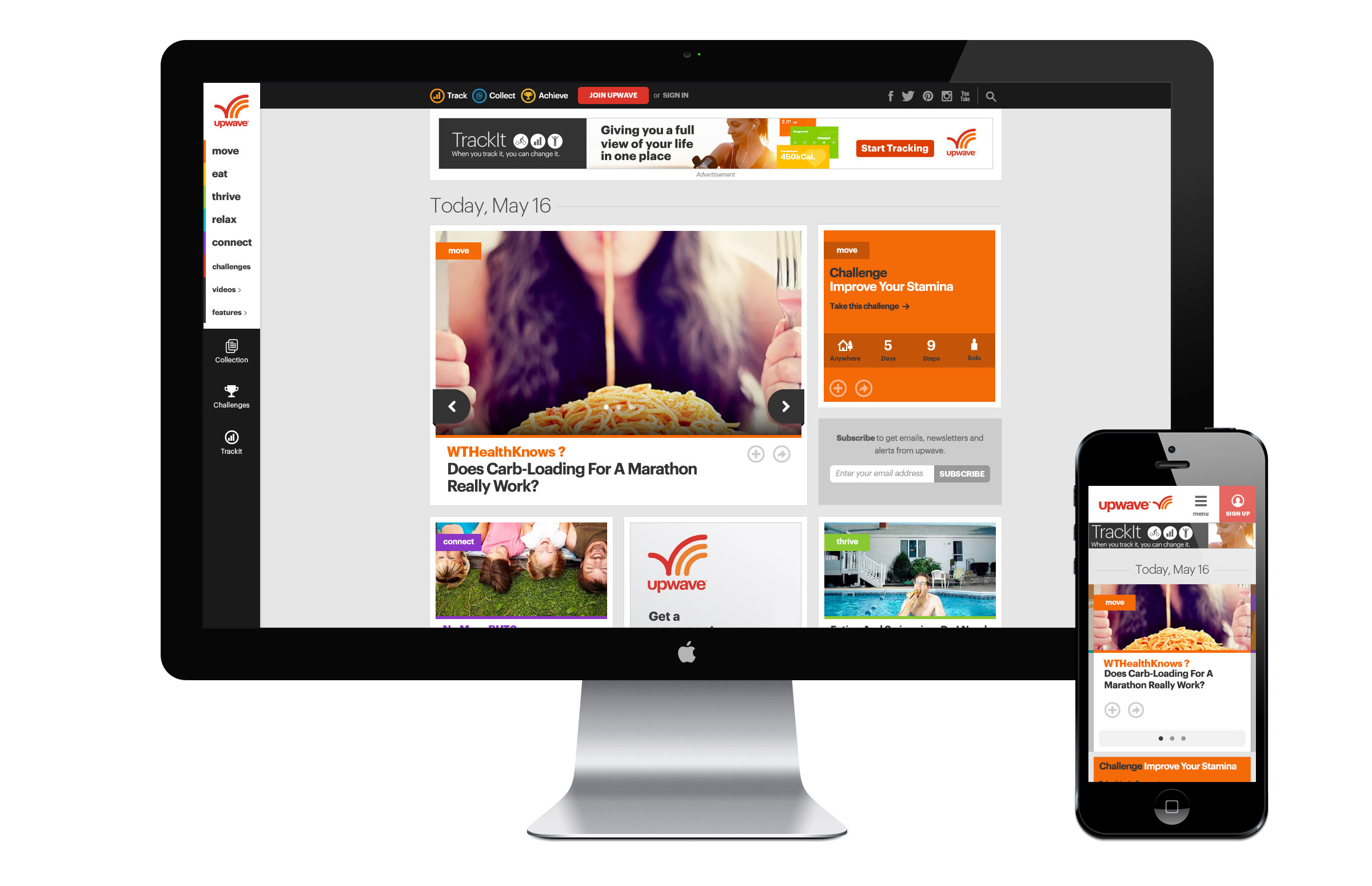
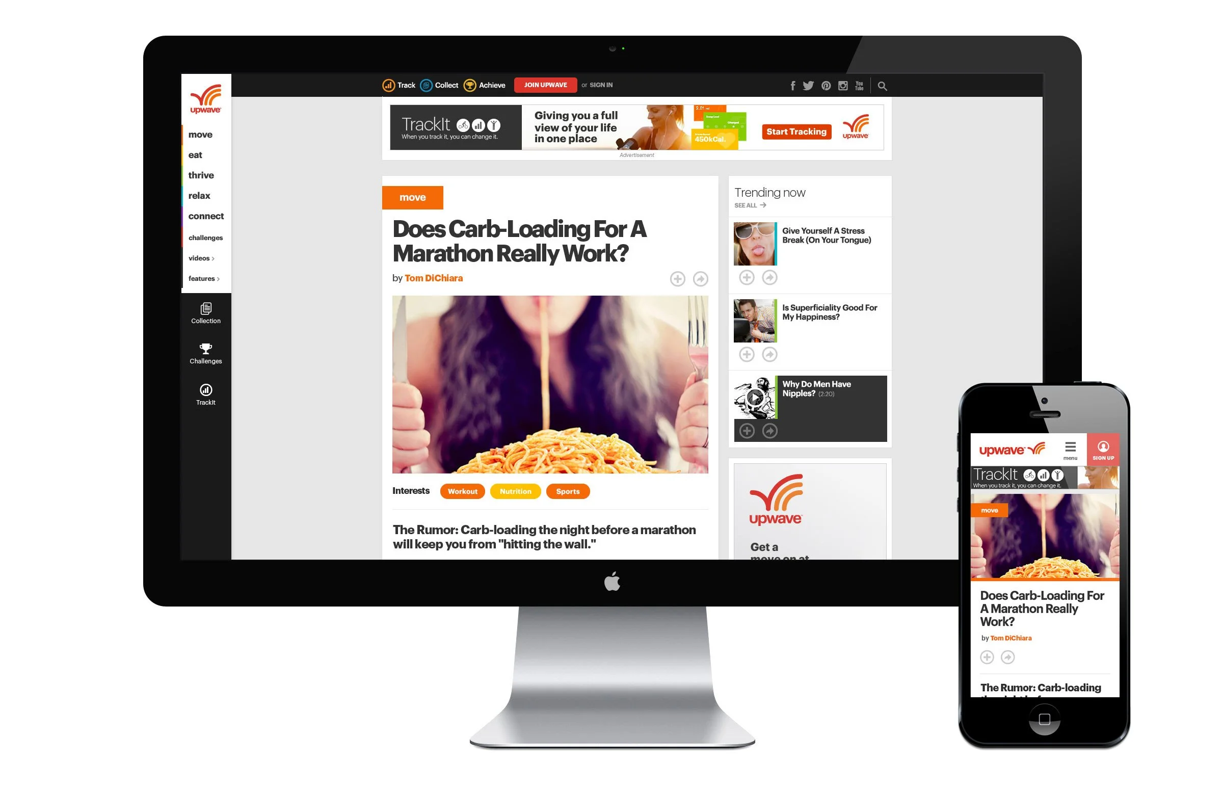
upwave was a health and lifestyle media brand launched by Turner Broadcasting. I led the design of upwave’s digital experiences from its launch in August of 2013 to the brand’s close in May of 2014. During that time, the multi-platform, digital-first start-up grew from nothing to 1 million average monthly uniques, 27.2 thousand registered users, and 9.5 million total visits in only 8 months.
Color
Each of upwave’s five content verticals were assigned a unique color. Along with the standard upwave red, this comprised the primary color palette. The secondary palette was made up of a limited color range anchored by each of the 5 vertical colors. The use of pure black was avoided in lieu of a softer dark charcoal, giving the experience a less severe, more approachable feel.
Typography
The primary typeface used across upwave was Graphik, a clear and stable neo-grotesque-style face that was tracked tightly at larger sizes. While Graphik made for impactful headlines, it had poor readability at smaller sizes. As a result, we introduced Open Sans for body copy. Designed with on-screen readability in mind, its more varied letterforms made for easier, effortless reading.
UI elements
Interactive elements across the site were designed for touch, even those used primarily on larger browser sizes. This made for larger, clearer actions on all platforms.
Cards
Cards were designed at three relative sizes that fit cleanly into the grid, providing page layouts with consistency and flexibility. The smaller card sizes were designed to be used on both desktop and mobile and the structural system itself was designed to withstand incremental expansion (i.e., additional card sizes).


Interfaces
Health content
upwave was designed to bring actionable, engaging health and wellness content to health strivers — people who were motivated to live healthier lifestyles. upwave hosted original articles, videos, challenges, and health tracking in addition to a weekly TV block on HLN. Content was organized around five core themes: move, eat, thrive, relax, and connect.
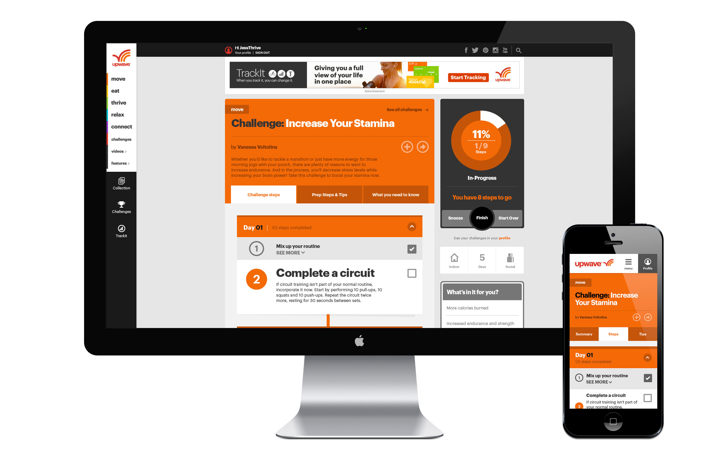
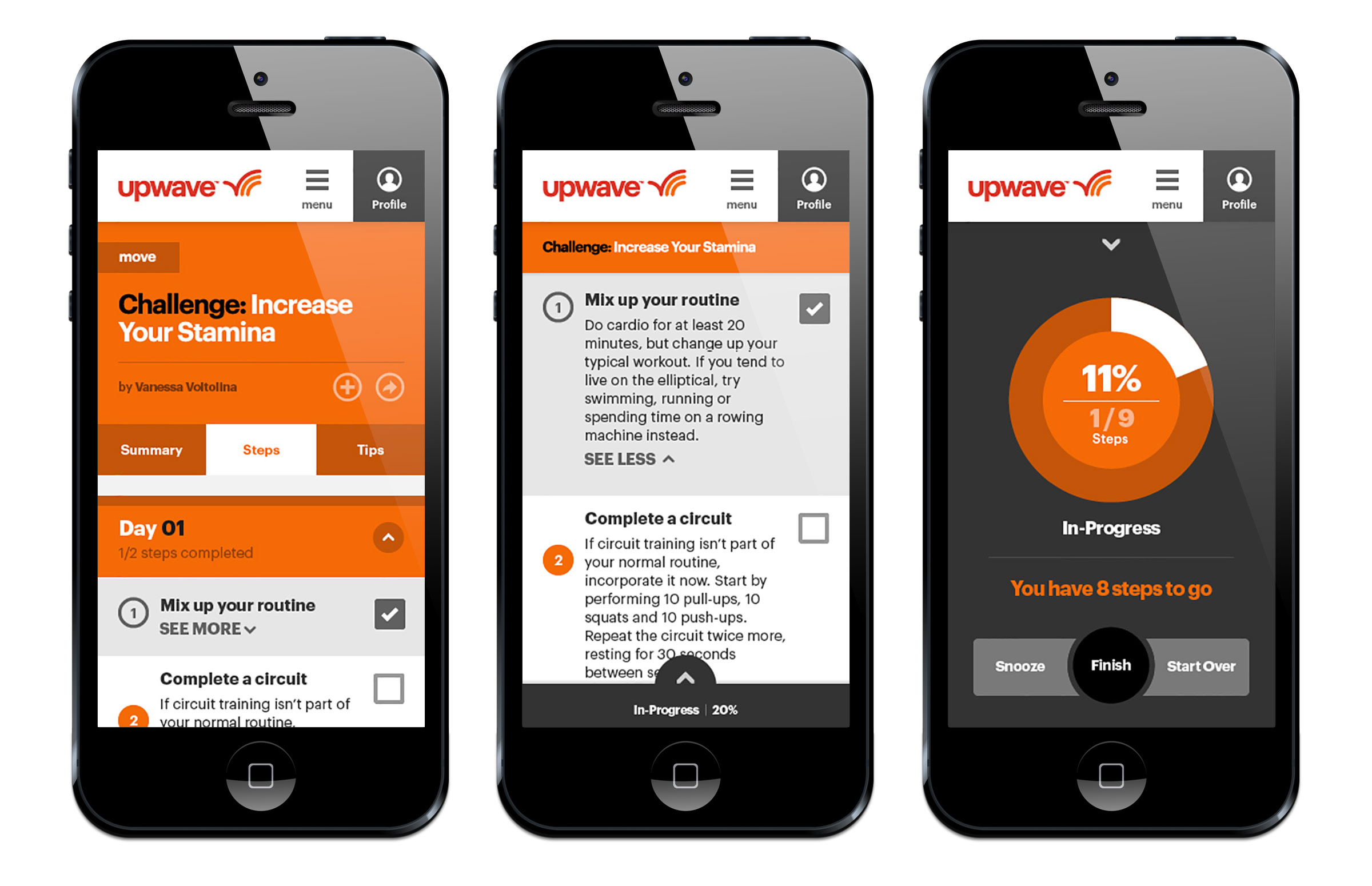
Challenges
Challenges offered users a clear, structured program to achieve a particular goal over a given period of time. Once users initiated a Challenge, they could check off a series of steps linked to bite-sized achievements that moved them closer to their goal. An interactive dial gave them feedback and encouragement along the way.
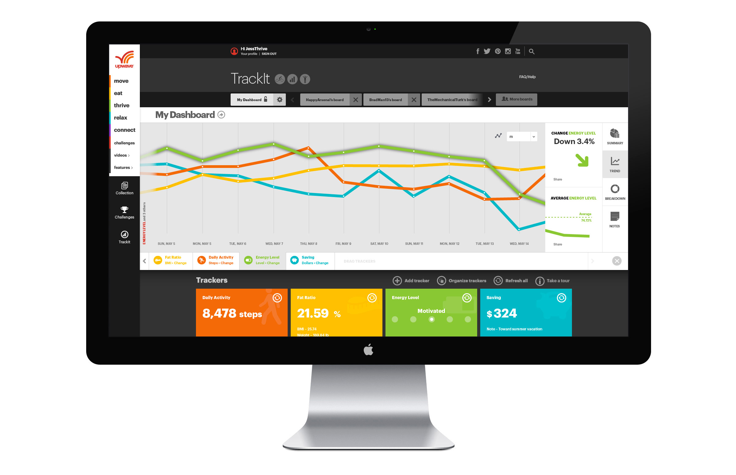
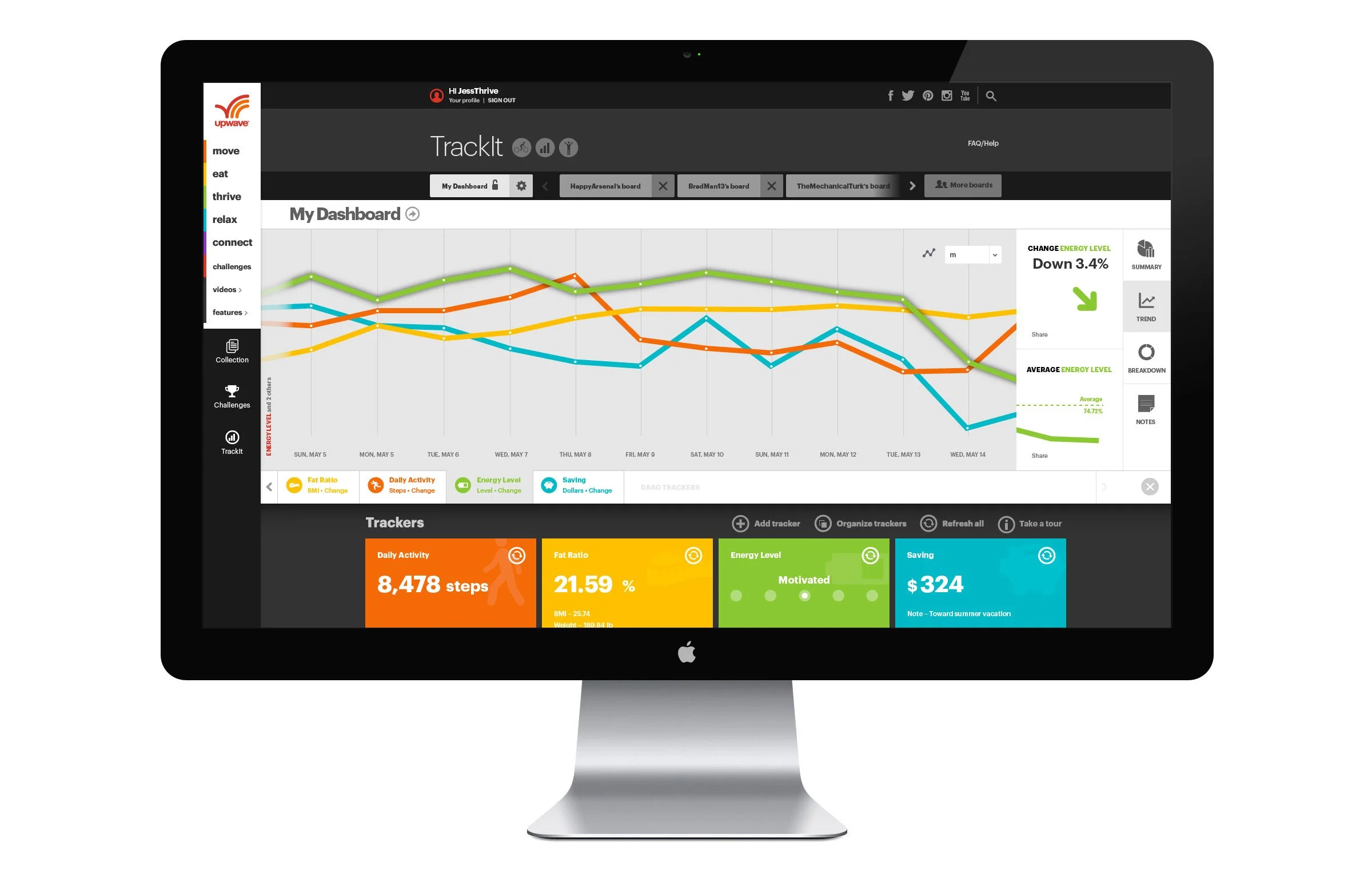
TrackIt
TrackIt was a web app that pulled together a user’s lifestyle devices and services and presented their data in one easy-to-find spot. Tracker Cards displayed individual data feeds (steps, local weather, coffee consumption, etc.) that could be pulled onto a staging area and plotted against each other to tell a unique story about a user’s activity.
A fresh, robust, and easy-to-use financial broadcast platform empowers and inspires investors at all levels
Role
Solo UX & UI designer for tastytrade.com. Ran visual brand strategy for dough, tastytrade, and tastyworks initiatives.
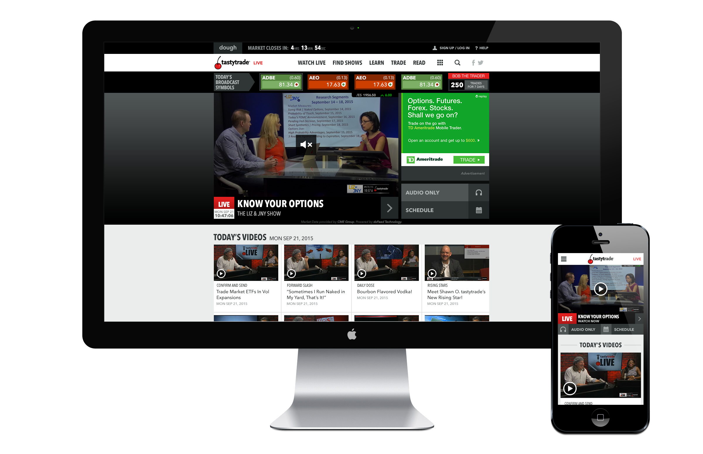
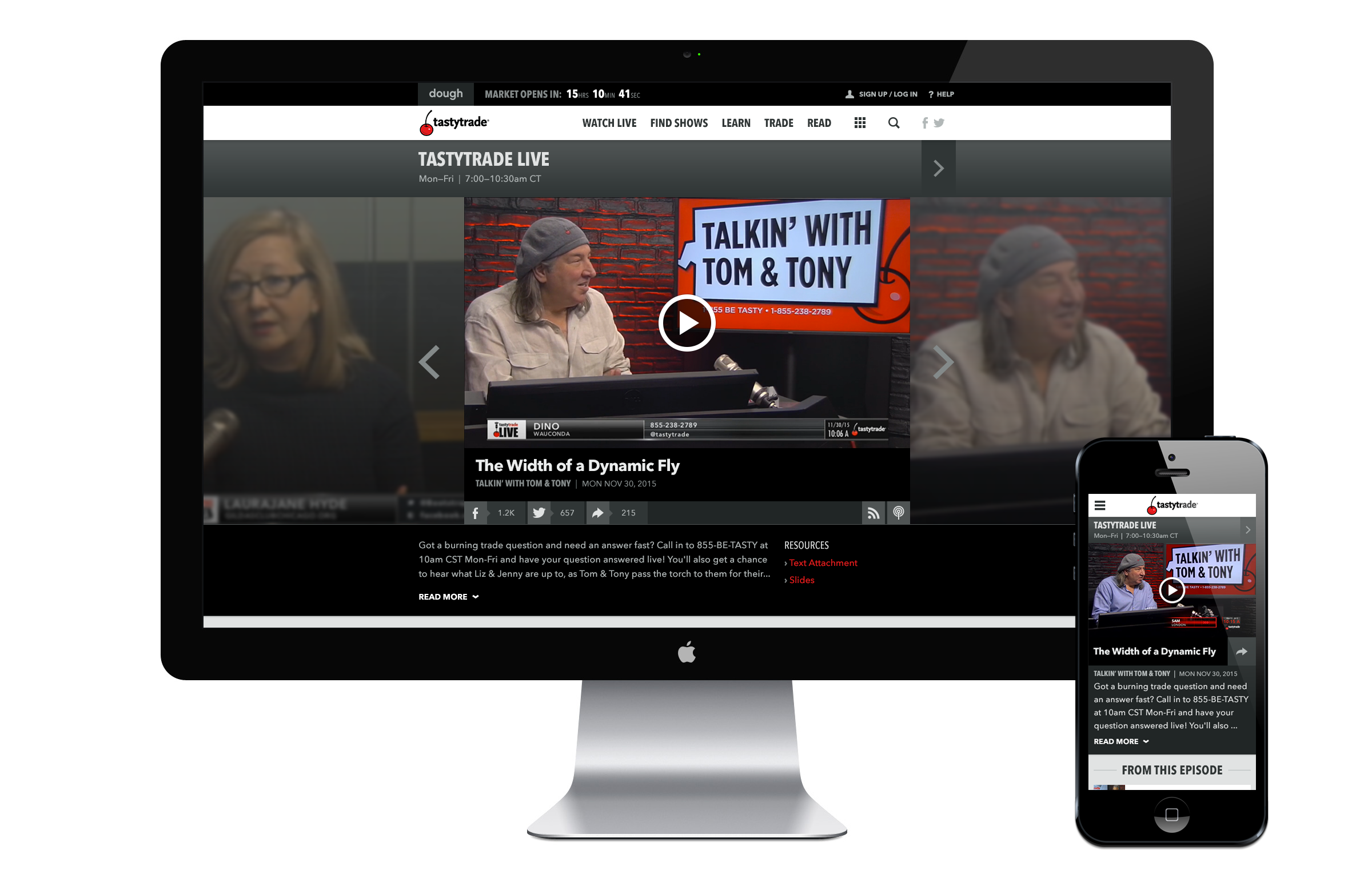
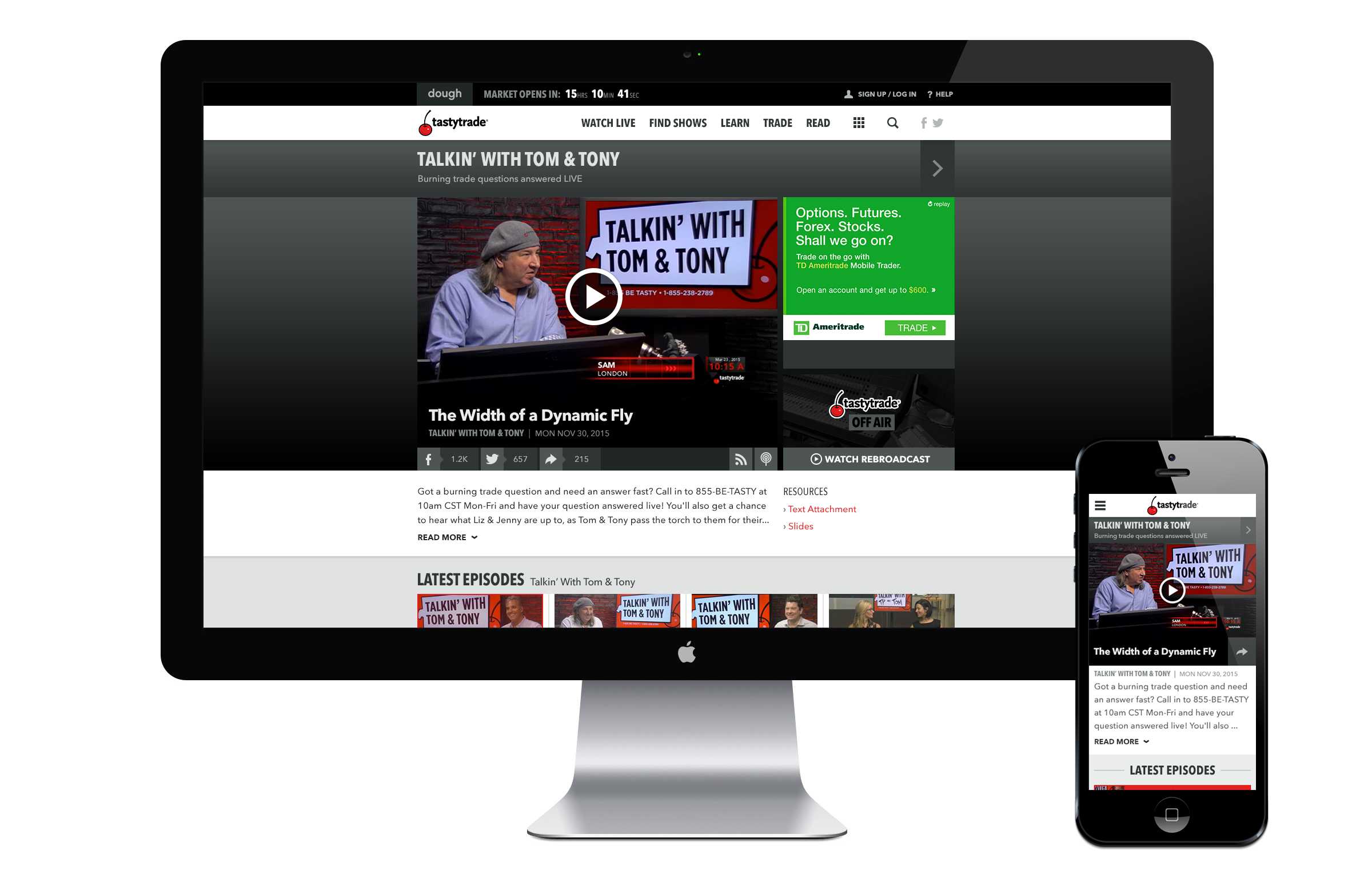
tastytrade (2013–16) / Principal UX/UI Designer
tastytrade empowers and inspires active investors at all levels through its namesake financial broadcast network, and dough, its innovative and highly visual interactive trading platform.
As Principal UX/UI designer from 2014 to 2016, I spearheaded a variety of digital and branding projects, including a complete redesign of tastytrade.com, where users could view the live broadcast, watch pre-produced content, and read articles about a variety of investment strategies.
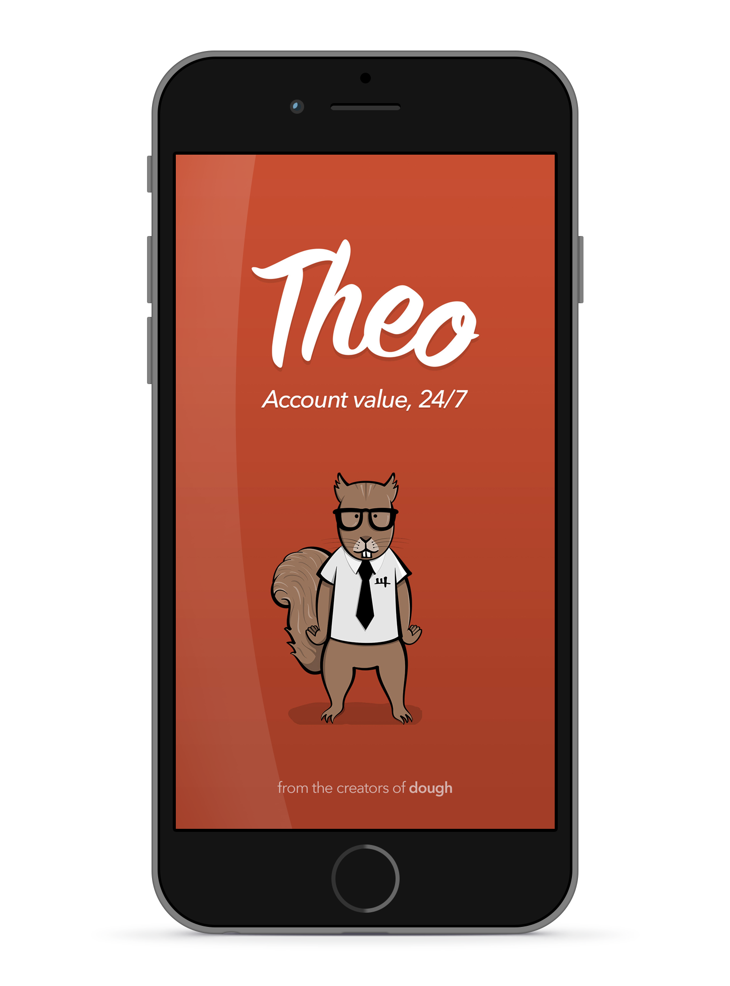
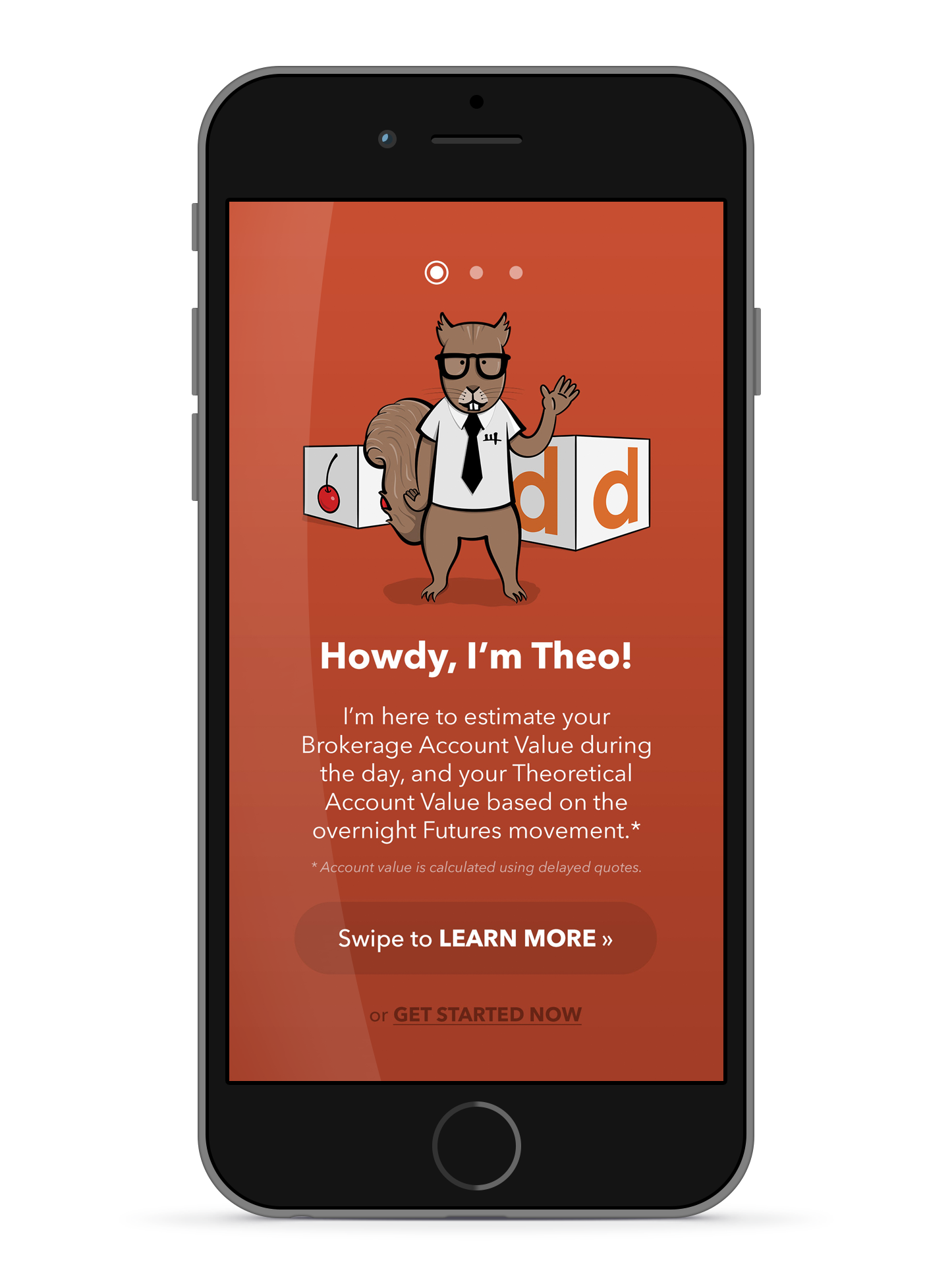
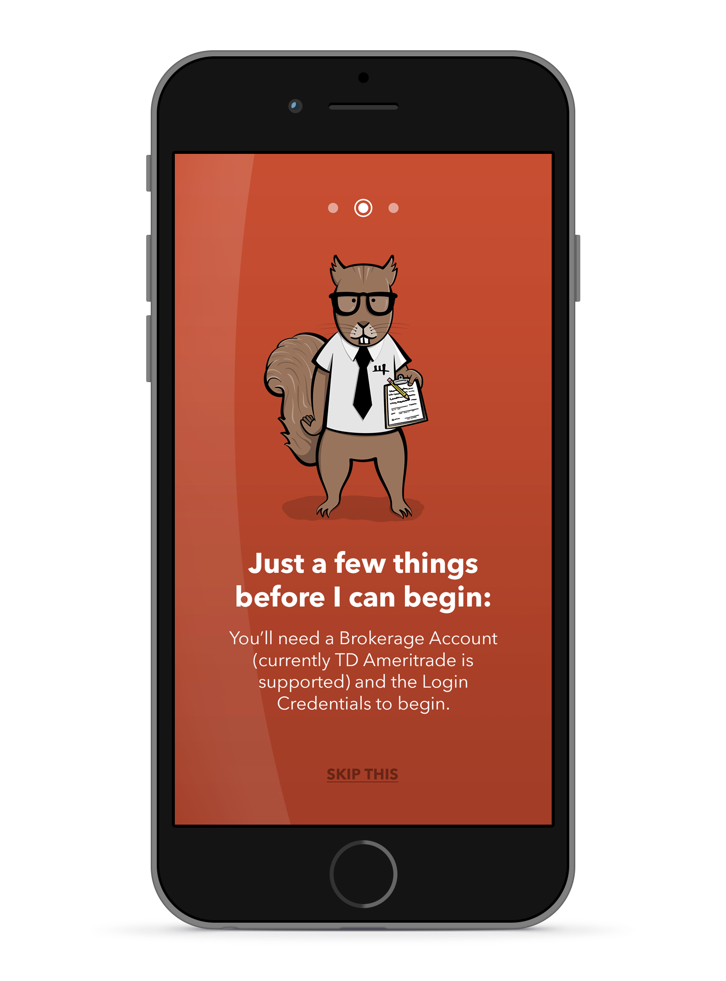
Theo app
In late 2014 I developed the brand for the Theo app for iPhone and Android. Theo offered an innovative way for traders to keep in-touch with their trading positions around-the-clock. It allowed them to see what their brokerage account was doing when the markets rallied overnight.
A series of independent destinations lends a niche feel to coverage from a news giant
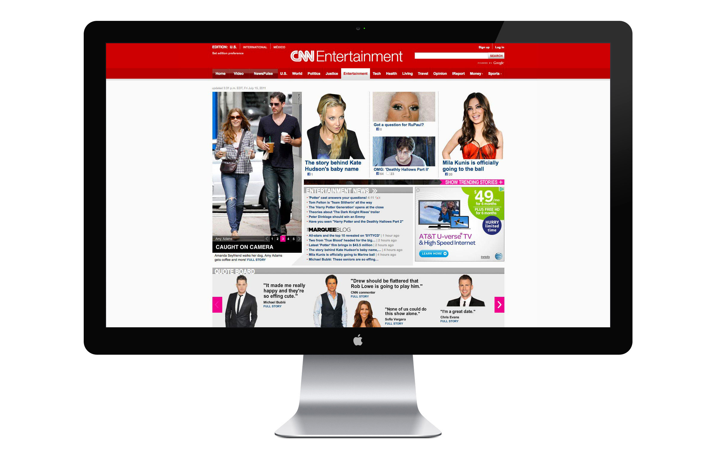
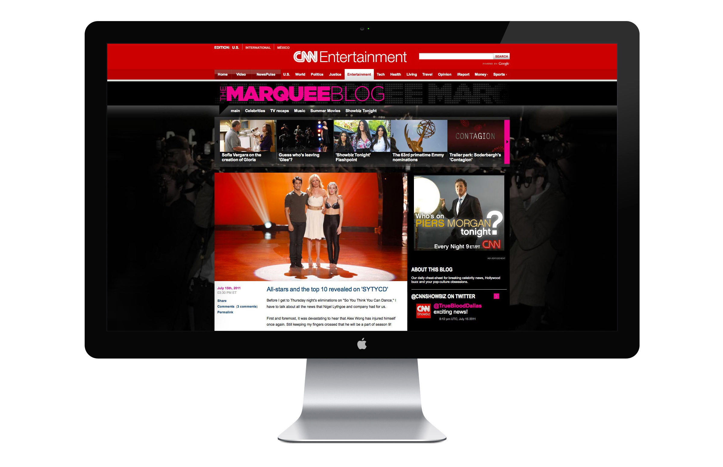
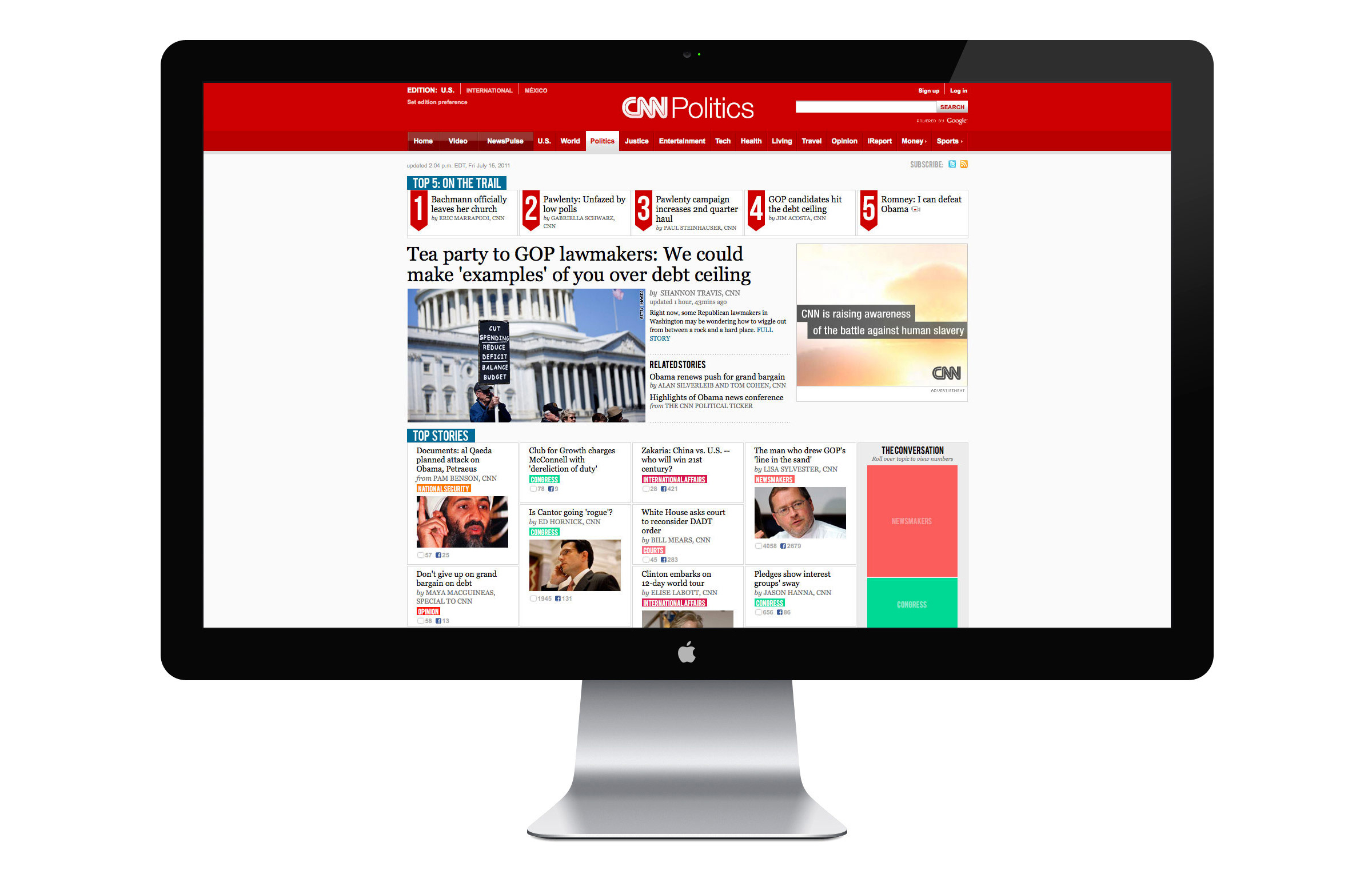
CNN (2010–12) / Lead UX/UI designer
Role
Solo UX & UI designer from ideation to execution
Content verticals
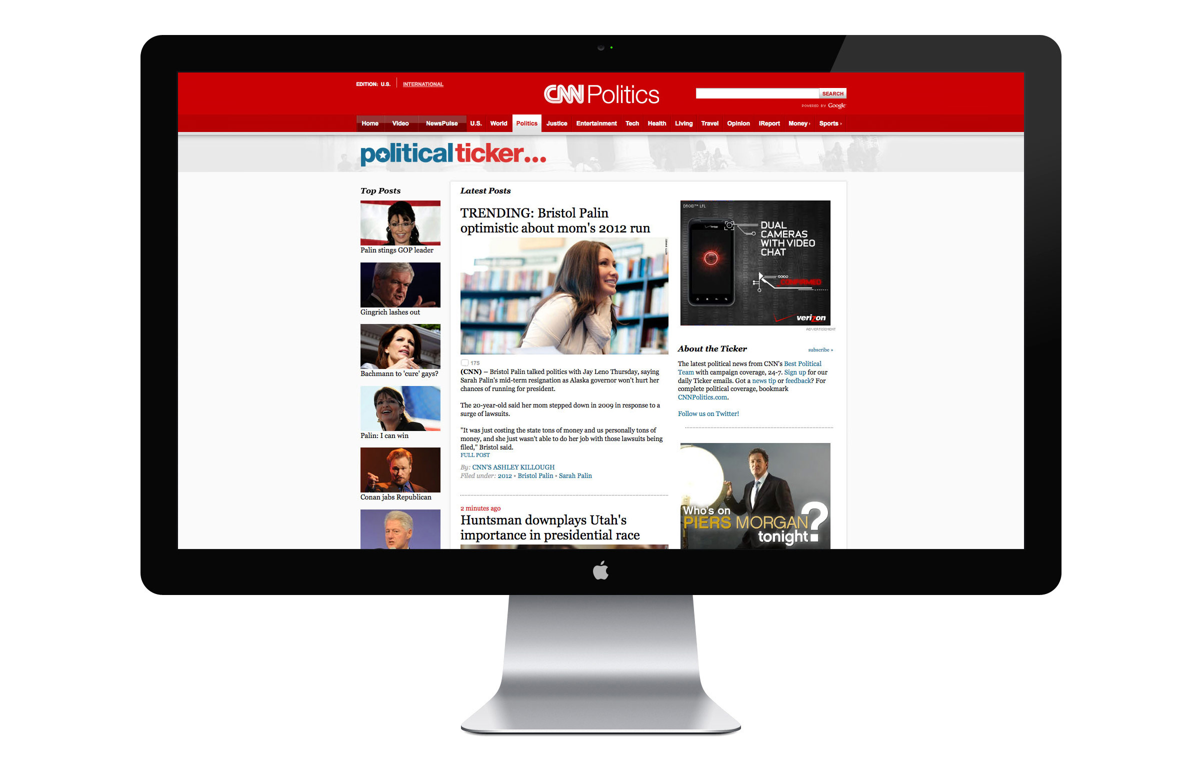
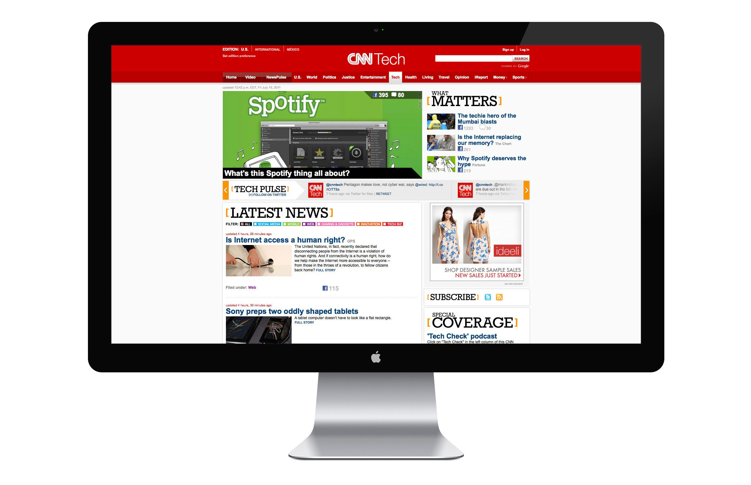
I led a re-branding and redesign of CNN's digital politics, entertainment, and tech coverage in 2010. The stated goal was to create a set of independent destinations for niche news coverage. The endeavor necessitated an overhaul of each section front on CNN.com as well as the CNN Political Ticker and The Marquee Blog.

CNN Trends
I led the design and branding of CNN Trends, which was a trending news aggregator powered by Zite. CNN Trends surfaced the top ten trending news topics from around the web. Each topic was anchored by a CNN story and included stories from other reputable sources, giving users a well-rounded picture of the news of the day.
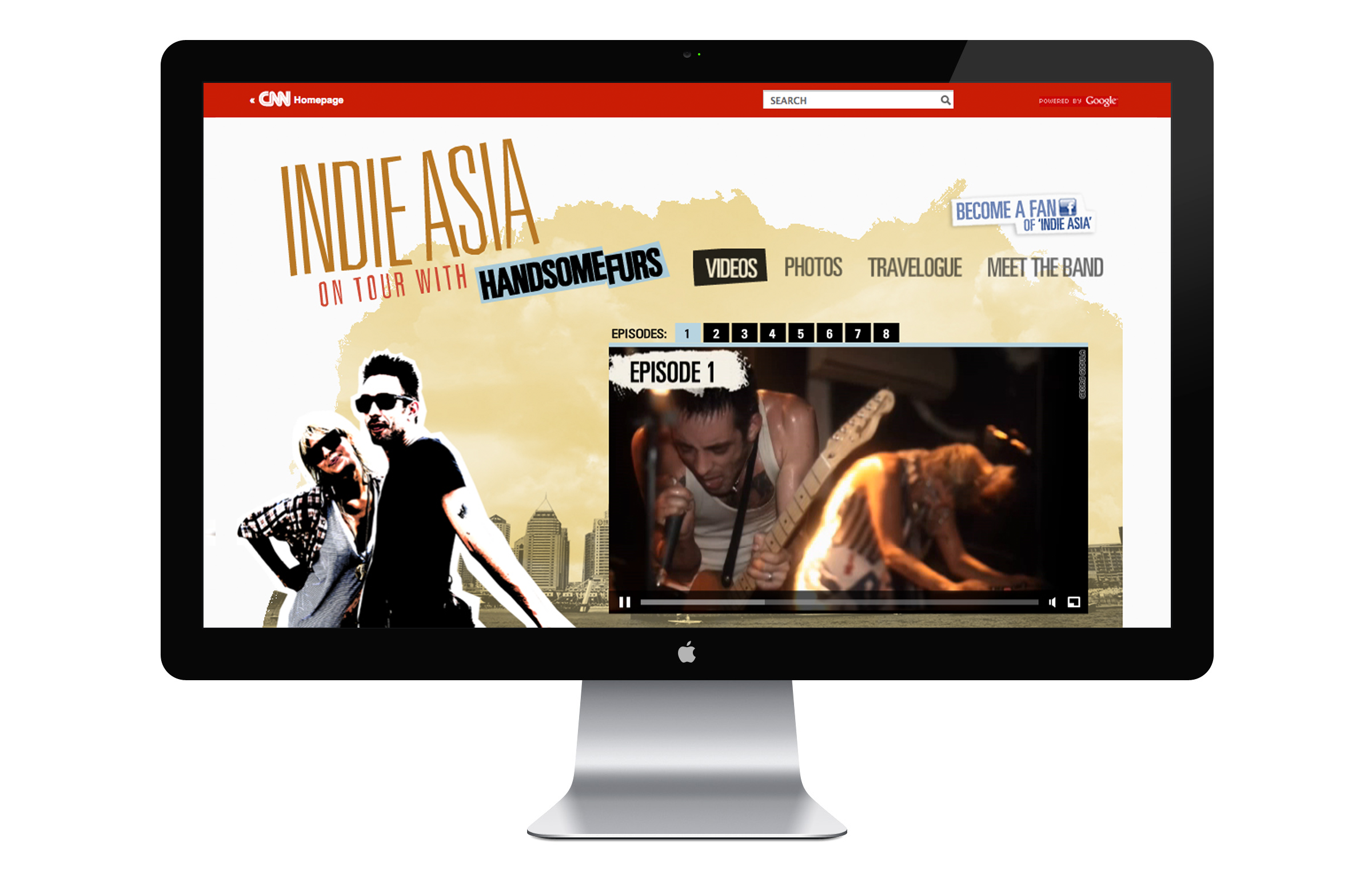
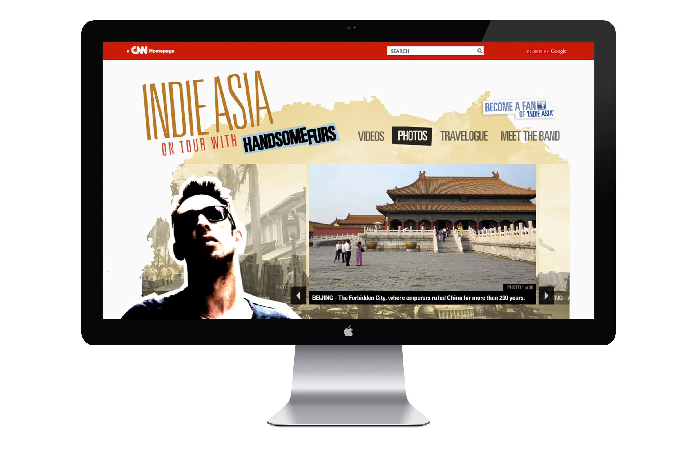
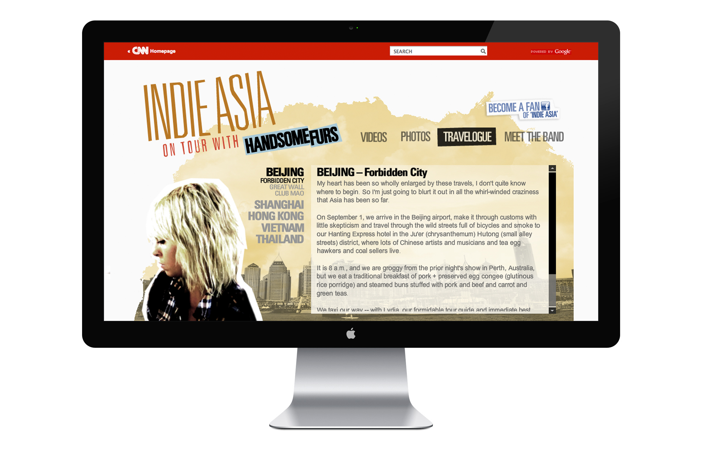
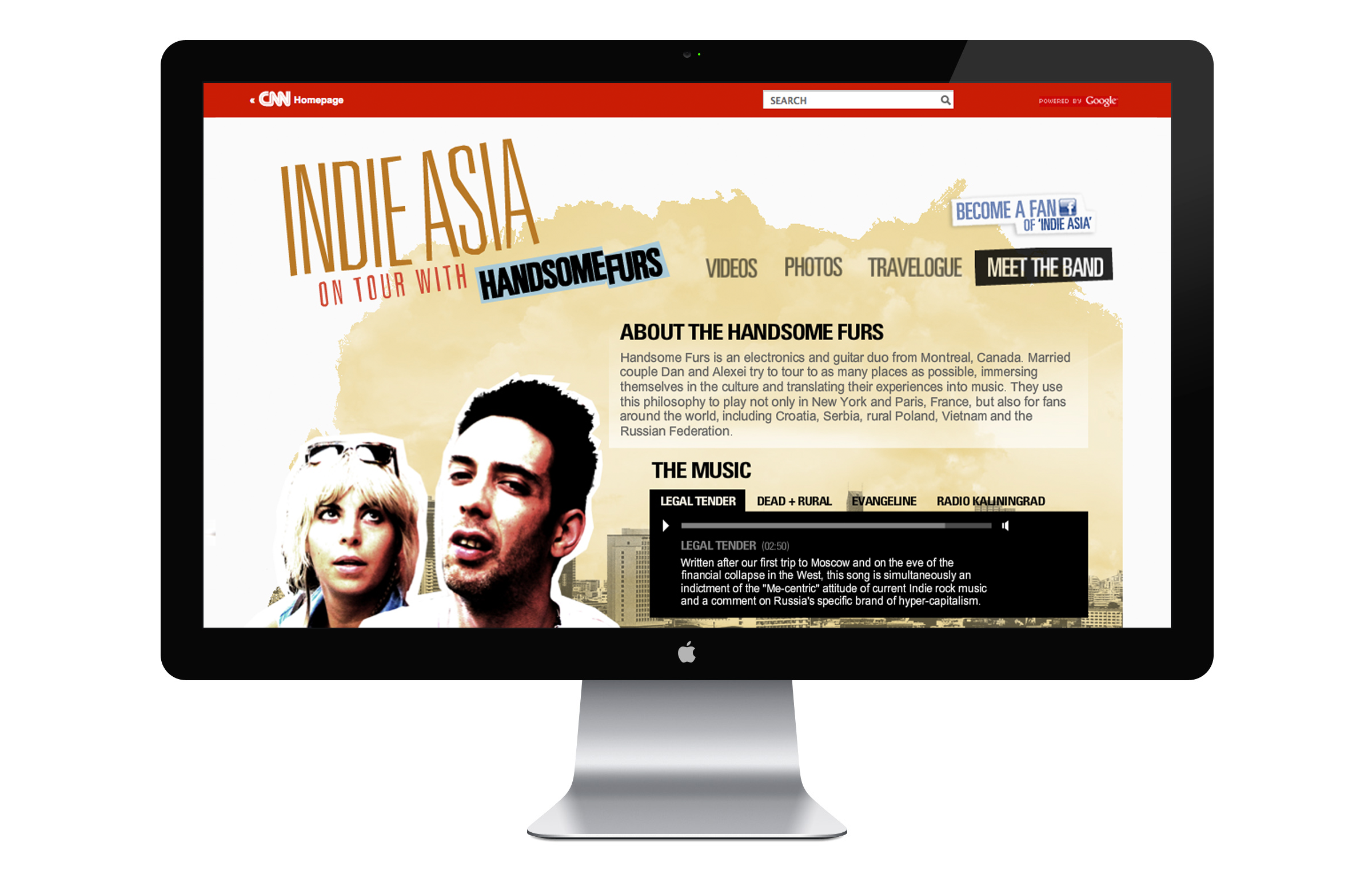
Indie Asia
CNN partnered with Sub Pop Records to create a series of videos chronicling the indie rock duo Handsome Furs' travels through Asia. Armed with flip cams and notebooks, Dan and Alexei guide viewers through the indie music scene in several Asian countries.